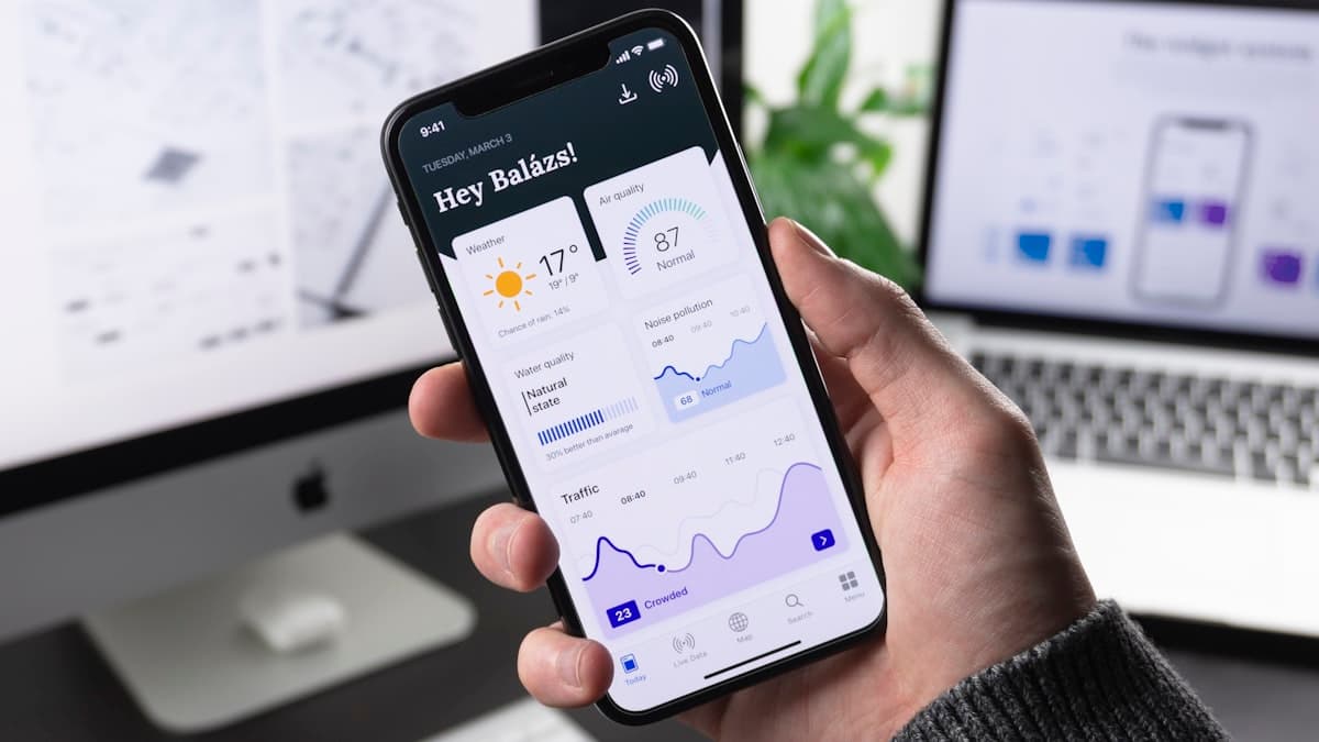
Responsive Design, Without the Headache
Every developer knows the pain. You spend hours crafting a beautiful desktop layout, only to open it on your phone and watch everything fall apart. Breakpoints, media queries, flexible grids — responsive design has always been one of the most time-consuming parts of front-end development.
At layout.dev, we believe your creative energy should go into building great products, not wrestling with CSS. That's why we're excited to introduce AI-powered responsive design — a feature that automatically generates layouts optimized for every screen size.
How It Works
When you build an app with Layout, our AI doesn't just create a static design for one viewport. It understands the relationships between your components and intelligently adapts them across breakpoints.
- Design Once: Build your app using Layout's chat-based interface. Describe what you want, upload a reference image, or start from a template. Focus entirely on the desktop experience.
- AI Adapts: Behind the scenes, our AI analyzes your layout structure — navigation, content grids, sidebars, cards — and generates responsive rules that maintain visual hierarchy across devices.
- Preview Instantly: Use the built-in device preview to see your app on desktop, tablet, and mobile simultaneously. Toggle between viewports in a single click.
What Makes This Different?
Traditional responsive frameworks give you a grid system and leave the rest to you. Layout's AI goes further:
- Smart Stacking: Multi-column layouts automatically collapse into single-column views on smaller screens, preserving the reading order that makes sense for your content.
- Navigation Transforms: Desktop navigation bars convert into mobile-friendly hamburger menus with slide-out drawers — no extra configuration needed.
- Image Optimization: Images resize and reposition based on the viewport, ensuring fast load times and proper aspect ratios on every device.
- Typography Scaling: Font sizes, line heights, and spacing adjust proportionally so your text remains readable without manual intervention.
Built for Real Projects
We tested this feature across hundreds of real-world app layouts — dashboards, landing pages, e-commerce stores, portfolios, and SaaS platforms. The AI consistently produces responsive designs that would take a skilled developer 2-3 hours to implement manually.
And because everything Layout generates is clean, editable code built on Tailwind CSS, you always have full control. If the AI's responsive choices don't match your vision, you can fine-tune every breakpoint directly in the editor.
Try It Today
AI-responsive design is available now for all Layout users. Simply build your next app and watch it adapt to every screen automatically. No more breakpoint debugging. No more layout shifts. Just responsive design that works.
